Android Lists: ListActivity and ListView III – Basic Layout and Formatting
Continued from: Android Lists: ListActivity and ListView II – Custom Adapter and List Item View
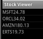
When I left off, we ended up with a ListActivity that displayed this:
Now, it’s a good start, but it would be even better if it was more readable. There is plenty of empty space on the screen right now, so we might as well use it. For starters, we can space out the ticker symbol and the quote, as well as adjust the font size to make everything easier to read.
If we pop open the res/layout/stock_quote_list_item.xml file, we can see that it’s quite plain right now, and it specifies very minimal layout specific attributes. The LinearLayout that the list item is currently using makes it so that all elements in the LinearLayout container are displayed one after another in a single row (or column, depending on orientation). Instead, we can switch the list item to use RelativeLayout, which allows us to specify the layout of the elements in the RelativeLayout container in relation to the parent element, which is the actual RelativeLayout container in this case.
Enough talk, let’s see what the modification of LinearLayout to RelativeLayout will do for our Stock Viewer application.
<RelativeLayout xmlns:android="http://schemas.android.com/apk/res/android"
        android:orientation="horizontal"
        android:layout_width="fill_parent"
        android:layout_height="fill_parent">
    <TextView
        android:layout_width="wrap_content"
        android:layout_height="fill_parent"
        android:id="@+id/ticker_symbol"
        android:layout_alignParentLeft="true" />
    <TextView
        android:layout_width="wrap_content"
        android:layout_height="fill_parent"
        android:id="@+id/ticker_price"
        android:layout_alignParentRight="true"  />
</RelativeLayout>
You’ll notice I also added an additional attribute to each TextView called android:layout_alignParentLeft or android:layout_alignParentRight. These two particular attributes are specific to the RelativeLayout, and you’ll notice if you’d just add these attributes to the TextViews without changing the layout to a RelativeLayout, you won’t see any effect. When set to true, these attributes make the left or right edge of the TextView match the left or right edge of the RelativeLayout container. Let’s take a look at what this has accomplished.
Hey, we’re making some progress. The two values are now spaced apart and it’s definitely easier to read than it was in the beginning. Let’s continue our layout and formatting journey by changing the color of the ticker symbol to white, making the font size larger, and adding some space between the list item separator. Add the following four attribute values to the ticker symbol TextView:
android:textColor="@android:color/white"
android:textSize="20sp"
android:paddingTop="4dp"
android:paddingBottom="4dp"
If you’re relatively new to Android, you might be wondering what in the heck “dp” and “sp” are and why aren’t we using something like “px” to specify font size and padding sizes. As you probably know, Android devices come in all shapes and sizes, which means the displays on these devices are not equal. One of the major differences between displays is the pixel density, meaning displays have a variable number pixels per inch. So, 160 pixels (160px) on one screen might be equal to an inch, where on another screen 160 pixels might only be equal to half of an inch due to an increased pixel density.
To deal the pixel density variations between screens, Android defines a density-independent pixel (dp) display unit that takes the device’s display density into consideration when calculating the size. The scale-independent pixel (sp) display unit is similar to the density-independent pixel except it scales the size by the user’s font size preference as well. While Android will allow you to use the pixel (px) display unit, it is suggested that all layout values use density-independent pixels and all font values use scale-independent pixels.
Now that that explanation is out of the way, this is what we were able to accomplish with those four attribute values:
Uh-oh! Now that we’ve increased the size of the ticker symbol font, the quote price value looks funky because it is being pushed to the top of the RelativeLayout container. Android makes it easy to center items within a RelativeLayout by setting the android:layout_centerVertical attribute to true.
That’s more like it. While this isn’t going to be the next big Android app, this is surely progressing along nicely from where were previously left off. The two text values in each list item are now distinct and separated from one another, which makes for a better application experience.
Final Code
<?xml version="1.0" encoding="utf-8"?>
<RelativeLayout xmlns:android="http://schemas.android.com/apk/res/android"
        android:orientation="horizontal"
        android:layout_width="wrap_content"
        android:layout_height="wrap_content">
    <TextView
        android:layout_width="wrap_content"
        android:layout_height="wrap_content"
        android:id="@+id/ticker_symbol"
        android:layout_alignParentLeft="true"
        android:textColor="@android:color/white"
        android:textSize="20sp"
        android:paddingTop="4dp"
        android:paddingBottom="4dp" />
    <TextView
        android:layout_width="wrap_content"
        android:layout_height="fill_parent"
        android:id="@+id/ticker_price"
        android:layout_alignParentRight="true"
        android:layout_centerVertical="true"  />
</RelativeLayout>
This entry was posted on Saturday, April 9th, 2011 at 12:53 pm and is filed under Android. You can follow any responses to this entry through the RSS 2.0 feed. You can leave a response, or trackback from your own site.


Austin Rasmussen June 8th, 2011 at 8:25 pm
Hi venki,
Could you provide the URL or description of the Yahoo! Finance API you’re talking about? The only one I was able to find was one that sent back a CSV file. Is this the one you are referring to?